You know that a picture is worth a thousand words, right? So, think of your homework cover in the same way. After all, it's your professor's first impression of your work, and if done well, it shows that you care and care. Now, remember that a good cover doesn't save a bad paper, but it can help raise your grade.
Read also:
- Word Online: what it is, features and use
- Google Classroom: Joining, Downloading, and Using Tools
- Best English-Portuguese translator: check out a list of 12 options!
What is a school work cover and what is it for?
I think everyone knows what the cape is, right? It has, mainly, the objective of informing the name of the work and who did it. But, it can contain other information and still be embellished. Keep in mind the topic and who will be reading your work.
The tips I'm going to give here are for all subjects:
- History
- Geography
- Sciences (Physics, Biology and Chemistry)
- PE
- Portuguese
- Mathematics
- Fine Arts
- And many more functions
o Do a cover work?
Basically, a good school paper cover should be organized and informative. She can also be beautiful, creative and unique. But, the priority must be information, ok?
So what to put on the cover of a job:
- The name of the school;
- to discipline;
- The teacher;
- Your name;
- Your series;
- Job title.
The order of each of these topics may vary. You can put a large title first and then the other information in a smaller size. If the school doesn't have a standard, I suggest you put the information in order from highest to lowest: school, subject, teacher, you and your grade.
Here's an example of a working cover:
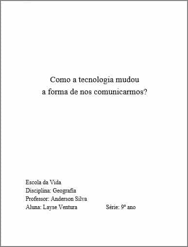
In general, if the work has a unique title (like an essay), you can highlight it in larger print. Now, if your title is, for example, “History work”, you don't need to highlight that information. After all, the teacher knows what it's about, right?
Job cover letter
In Design, we learn the following rule (which I think can help you). You can draw attention to text by changing the font size, font style, and color. That is, see what information you want to highlight and highlight it, okay?
The o is basically up to you. However, I also want you to think about a few things. First, reading text on a computer is completely different than reading printed text. Therefore, make the font size 12 at least.
Personally, I like to set the line spacing to 1,25. So, I think it makes it easier to read. I know you're young and I hope you don't have to wear glasses. But, your professor probably has more tired eyes – besides, he'll be reading a lot of papers. That is, help him understand his work.
The color of the letters on the cover may differ. But still thinking about readability, think about creating contrast. Have you noticed that the dark mode on your cell phone or computer uses light letters? So follow the same logic. If using colored paper (I love it!), use a color that contrasts with the letter.
Finally, have you ever heard of serif? It's a different name, but for something very simple: how much the letter you're using is drawn or not drawn. See the following examples:
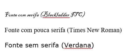
Do you agree that the first one is harder to read? So, as much as you like something more pompous, don't spoil the reading because of your personal taste.
Job cover images
You can use photos to illustrate the cover of school work. You already know Google, but did you know that there are free image banks to find the perfect image? I'll give you some tips: Unsplash, Nappy and Pexels. In these places, you can find images without the watermark (that text on top of the image, you know?).
Extra tip about photo printing
If you're one of those passionate about images, I'll give you some extra tips for choosing good photos and not stretching them to fit, okay? In photography, there are two names you should pay attention to: dimension and resolution.
The dimension is the size of your photograph and can be measured in pixels, o for example 1280 x 720 px. In short, it's what makes an image small or large.
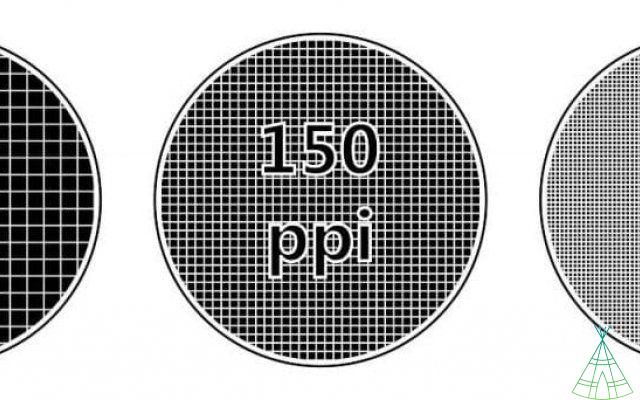
The resolution is the quality of this image and will usually be reported in dots per inch (DPI) or pixel per inch (PPI). Pay attention to these measurements! Although they are not synonymous, people treat them as if they were. To get a good impression, your photograph must have 300 DPI or PPI:
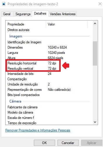
o Do I see DPI or PPI? Right-click on the image saved on the computer and tap on “Properties”. Then select the “Details” tab:
I want to give one last tip on this topic. In Word, when you tap on the image, the “Image Format” tab opens. In addition to several simple editing tools, there is a very useful one, “Cut”. Use it! You can change the aspect ratio, format (how about a star shaped photo?) and adjustments.
or print
Now that the content is written and the cover work ready, you must print everything. But, before printing all the sheets, check the margins of the job and the cover. Ah, the margin is that blank space between the beginning of the page and the text itself – it's the same as in the notebook, a space between the spiral and the line, ok?
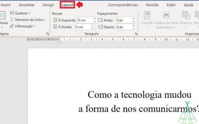
In Word, you can change the tabs in the “Layout” tab, in the “Margins” item. You can also click that top or side ruler:
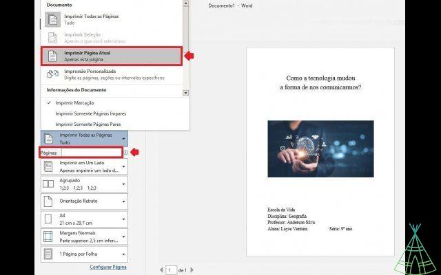
Did you know that you can see what the print will look like before actually printing? The print preview shows you exactly how your work will look. So if you see an error there, you can be sure it will show up on paper too.
My tip: print a test page. You can choose “Current page” or page number.
work cover ideas
Do you need inspiration for your school work cover? You can always use Google Images or Pinterest to come up with good ideas, but use your creativity. If you like Lettering, for example, it might be a good opportunity for you to train your personalized alphabet.
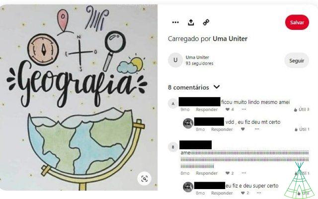
Here's an example of an inspiring job cover I found on Pinterest: